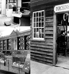
“An awkward attempt to marry the classical and the modern, the building is legitimately neither… [but] In terms of its contents, a completely fascinating mélange…an absorbing adventure.”
—Ada Louise Huxtable, The New York Times architecture critic,
January 23, 1964
Architecture Reviews
MHT opened to mixed reviews. Its popularity with the public was unquestioned. The Museum welcomed 5.4 million visitors in its first year, reportedly breaking the record for any museum anywhere. “Museum is a Shrine to Rise of U.S. as Nation: Original Star-Spangled Banner Waves Again” and “Americana at its Best” were typical headlines. Highlighted as “a certain crowd puller” were period rooms taking visitors back in time.
While the press heaped praise on the exhibitions, architectural critics were not as kind. Walker Cain’s attempt to blend classical and modern seemed baffling and even annoying. The New York Times critic Ada Louise Huxtable, for example, judged MHT’s design a “disaster.”
Huxtable and like-minded critics would likely have preferred an all-out modernist architect like the late Eero Saarinen. In fact, Saarinen had been proposed as MHT’s architect by the General Services Administration, overseer of government building projects. But Smithsonian officials rejected him for his “utter disregard for orthodoxy.”
Period rooms
Stohlman’s confectionary shop, Everyday Life in the American Past exhibition; a 19th-century American machine shop, Hall of Tools; and the Numismatics Hall.


